Not only are traditional nursing schedules notoriously intense, but facilities can find themselves short on nurses to the detriment of their patients, plus a fine. ESHYFT aims to solve these problems by connecting available nurses to facilities in need.
This project consisted of a mobile nurses app, a responsive facility portal, and a marketing website. I worked as the UI designer and UX expert with a project manager and team of developers.
Application
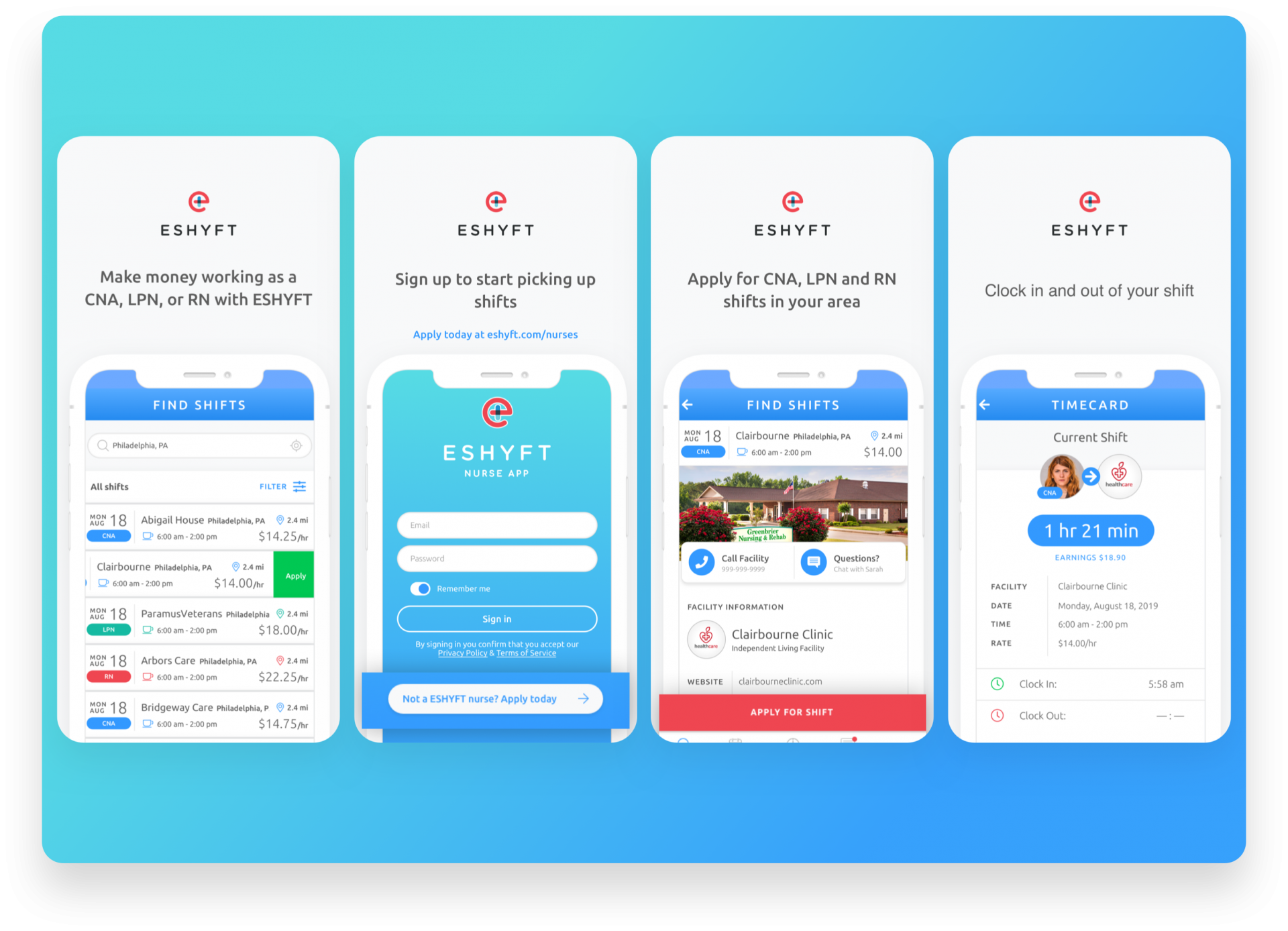
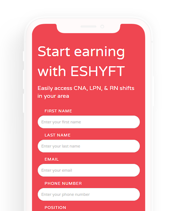
Nurses apply to be ESHYFT employees and gain access to the shift library.
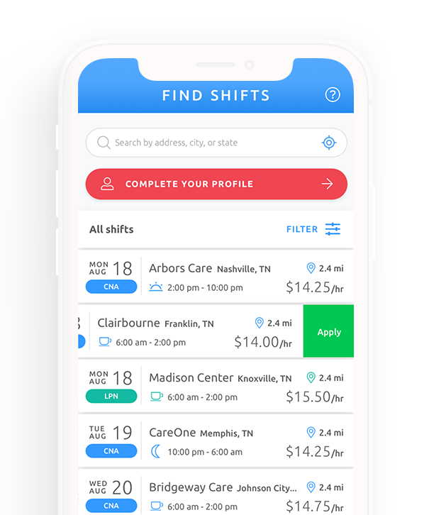
Browse
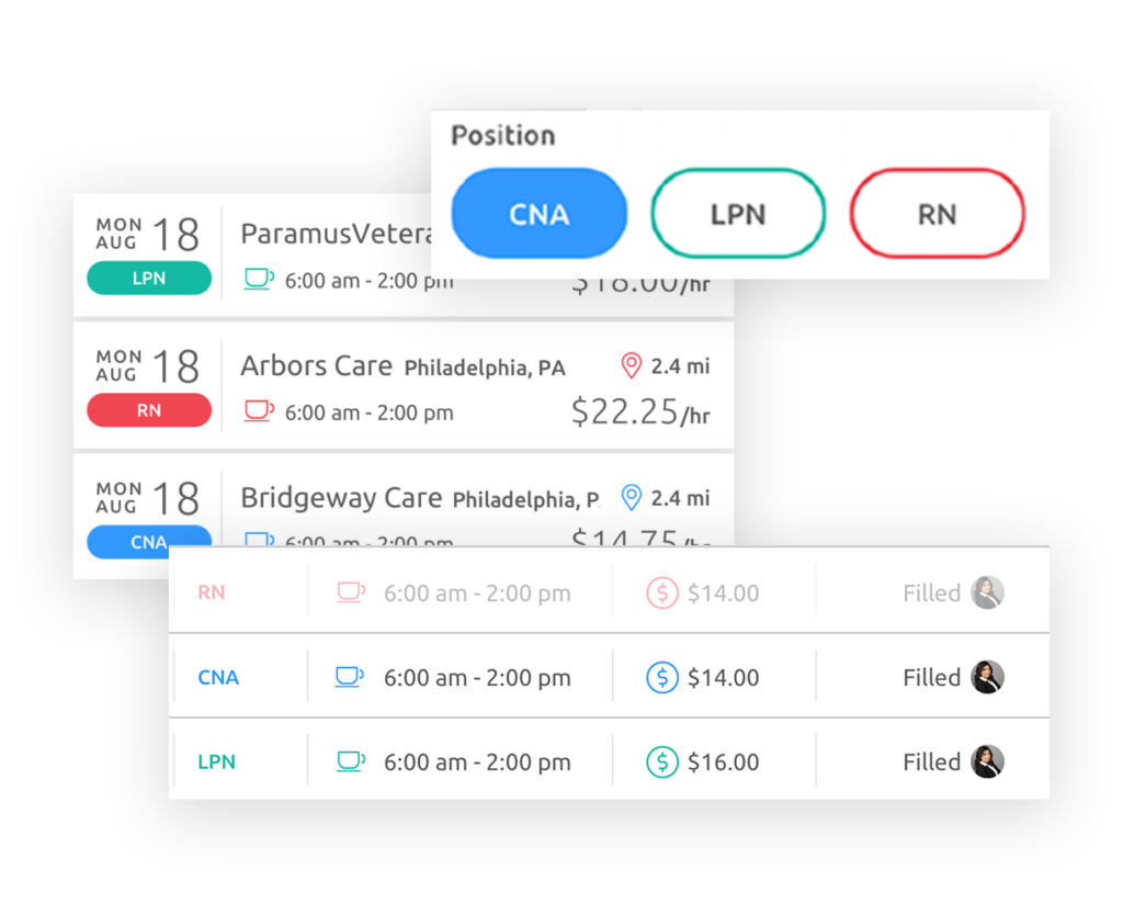
Nurses browse available shifts by distance and time applying with a simple swipe.
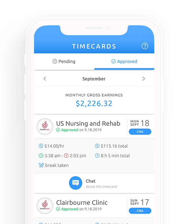
Payment
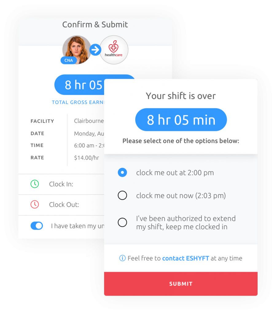
Timecards are automatically generated after shifts are completed.
Nurses App
Nursing on your schedule.
As an ESHYFT employee, nurses get access to a shift marketplace where they can browse and pick up shifts that need filling that work with their preferred schedule. At their shift they can clock in and out of their shifts in-app and when they're done get paid for their work at multiple facilities in a single paycheque.
This app was designed so nurses could apply to many shifts with minimal effort and keep track of their schedule, work-related conversations, and payments in one place.
The timecard was carefully developed to take over the app screen during and after a shift until the nurse has manually clocked out. It defaults to clocking out at shift end, but allows for minimal effort interactions to clock out as the nurse is leaving the shift in a more traditional time clock fashion, or extend a shift with permission.
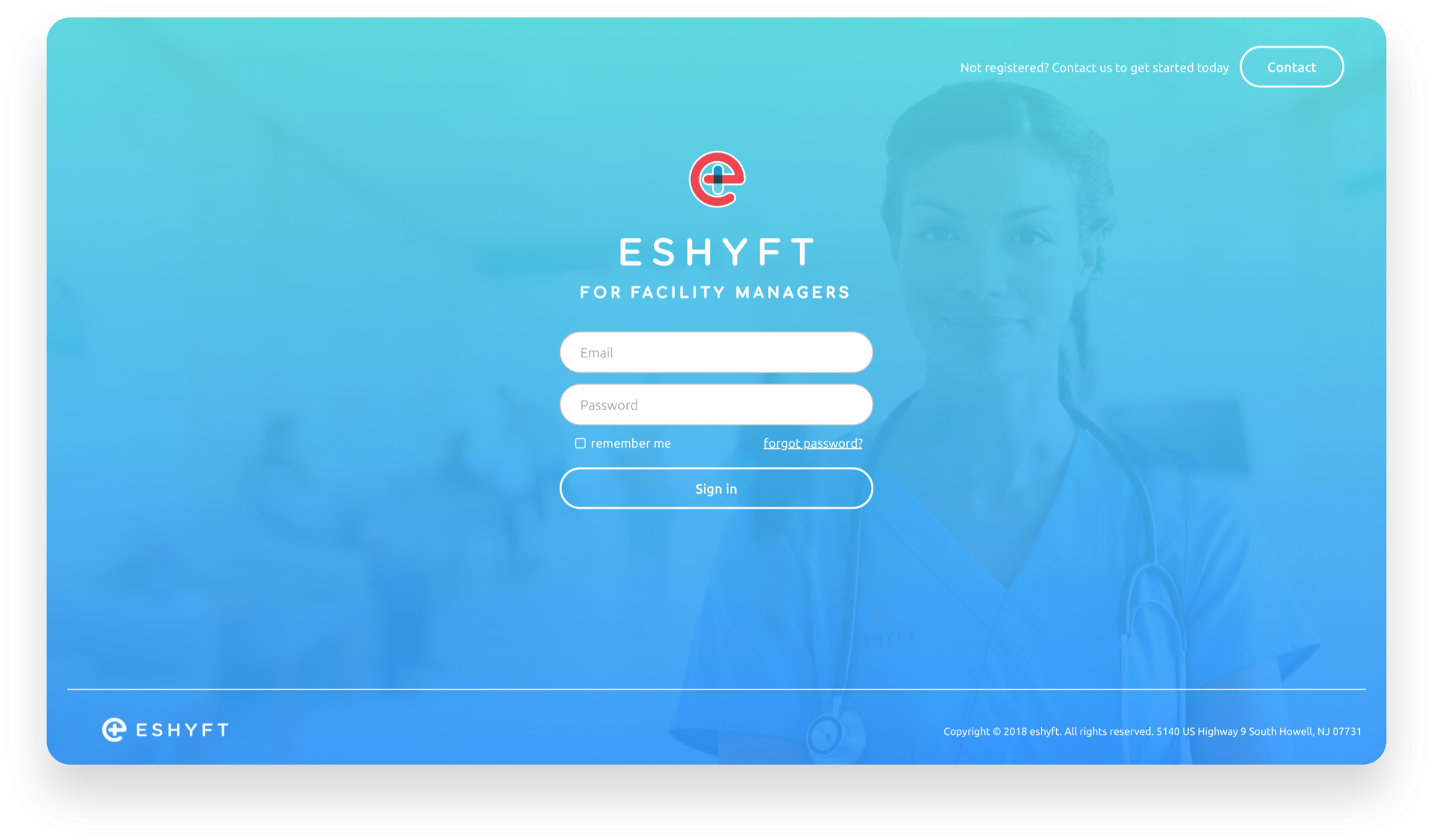
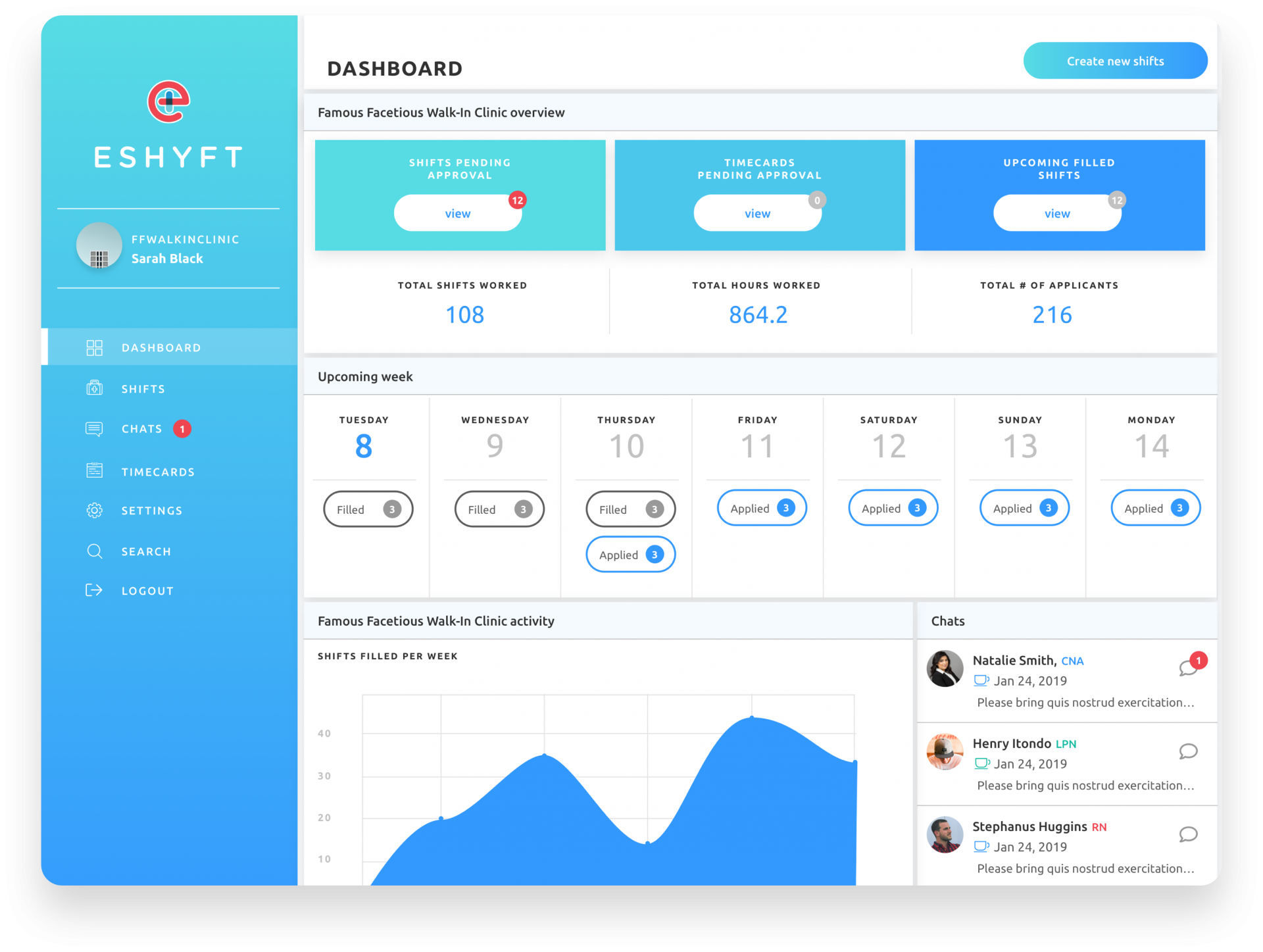
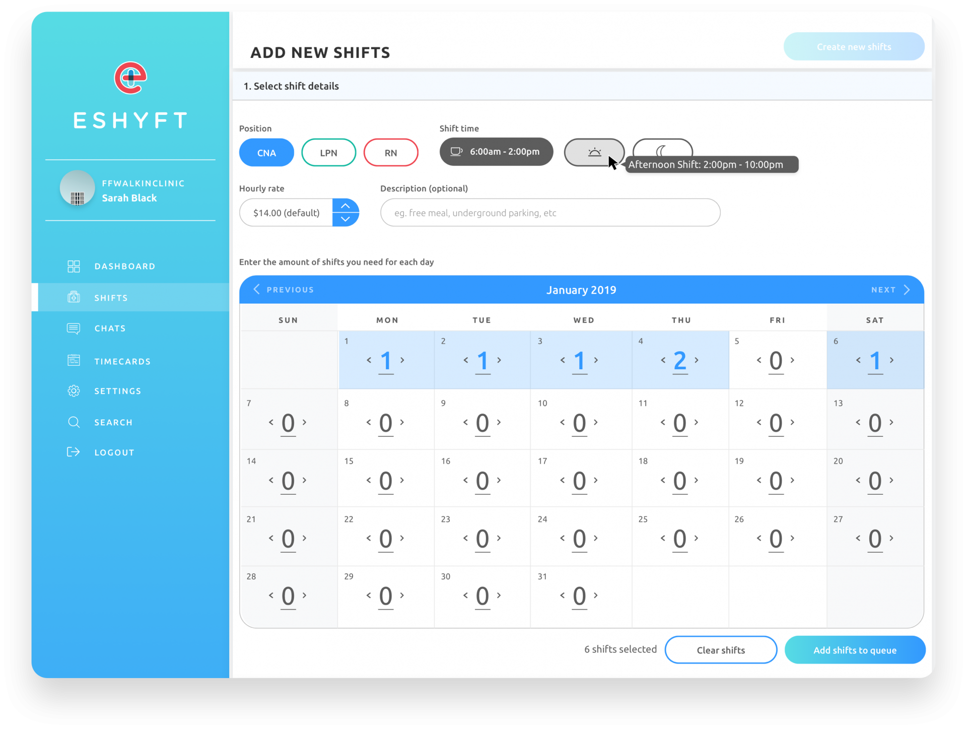
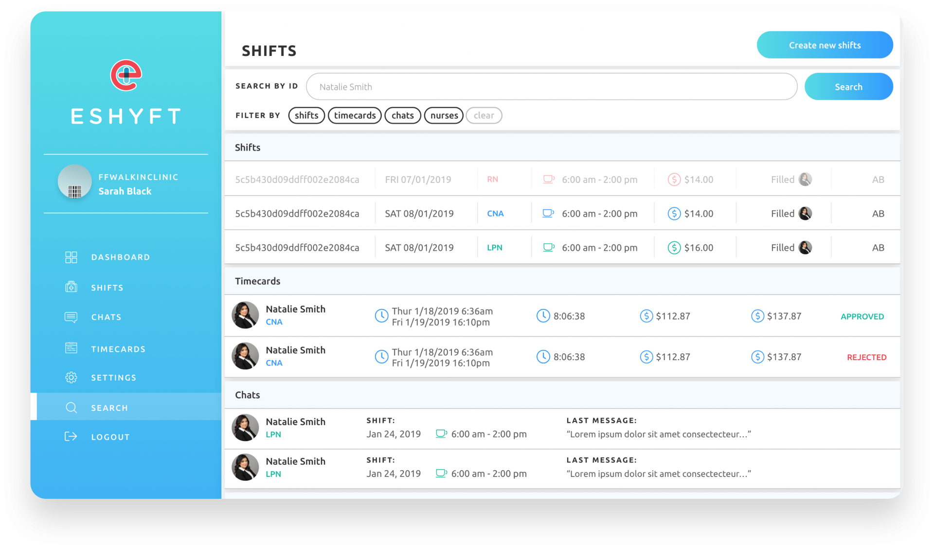
Facility portal
Simplifying staffing.
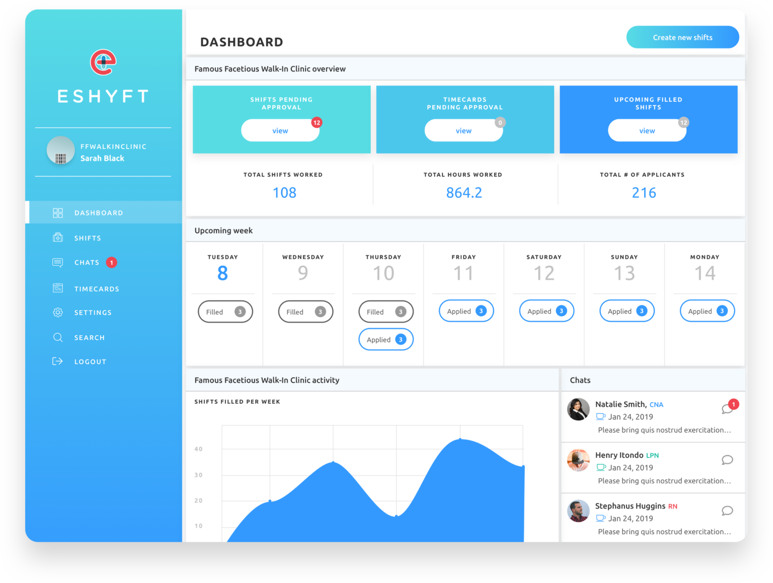
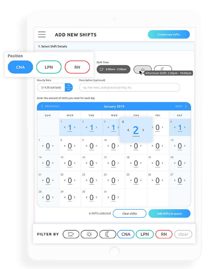
Facility managers can post available shifts in bulk on the desktop portal, or quick individual shifts on mobile. They can select nurses for the shift based on qualification and most importantly, whether they have worked at the facility before.
Colours were used intentionally so users could see at a glance the type of nurse they were working with. CNAs, the most common type of nurse, are in the common blue used frequently. LPNs are in the less commonly used green, which leaves RN, the most expensive type of nurse, to be represented in red.
This colour structure reinforces the brand, but much more importantly it allows facility managers to register more accurately what type of shifts they're scheduling, helping to avoid mistakes.
facility Portal
Desktop by default.
Facility managers do the bulk of their scheduling on windows computers. We built a powerful desktop portal to handle bulk scheduling.
Responsive
Fits comfortably in two hands.
While the ESHYFT facility manager portal was designed with the best experience on desktop, a tablet-sized view has also been considered for facilities working primarily on iPads.
More
Take a look for yourself.
Check out the marketing website and the case study by the agency I was working with.
This project was completed in 2019 where I worked as the UI designer and UX expert alongside an overseas team of developers.